TRAVEL · SERVICE DESIGN
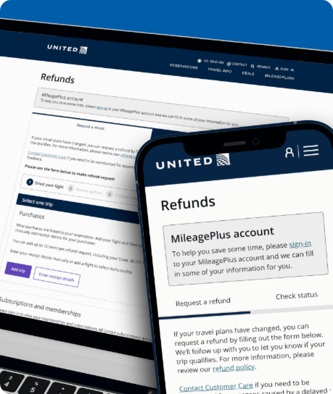
I redesigned the refund journey so travelers could understand eligibility, submit confidently, and know what would happen next.
PROBLEM
Policy language, unclear steps, and limited updates created anxiety and drove avoidable calls to customer service.
APPROACH
I combined competitive research, policy review, and customer interviews to connect service rules with real traveler expectations.
01
Compare policies, digital flows, and notifications.
02
Explore expectations, anxiety, and support needs.
03
Connect policy rules to traveler and operational handoffs.
APPROACH · MARKET RESEARCH
Delta, Southwest, and American Airlines demonstrated useful patterns in proactive updates, mobile-first management, and accessible policy content.
APPROACH · USER INTERVIEWS
Travelers described difficulty finding information, long waits without updates, and anxiety around fees and policy terms.
Remove jargon from instructions and status updates.
Show what is happening in real time.
Keep help close during disruptions.
APPROACH · USER PERSONA
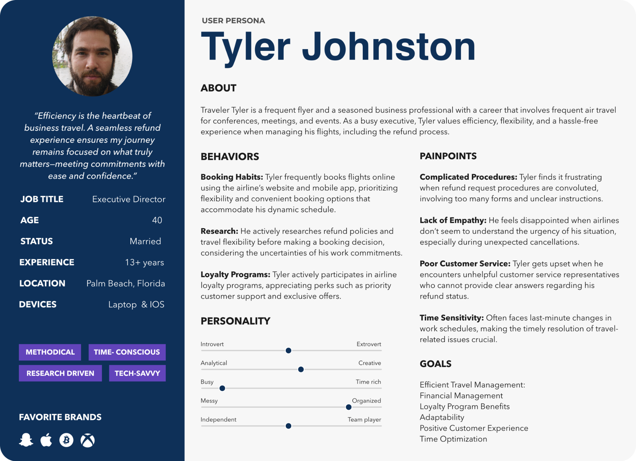
Tyler represents a frequent business traveler who wants flexible self-service, predictable timing, and updates without calling United.
APPROACH · USER JOURNEY
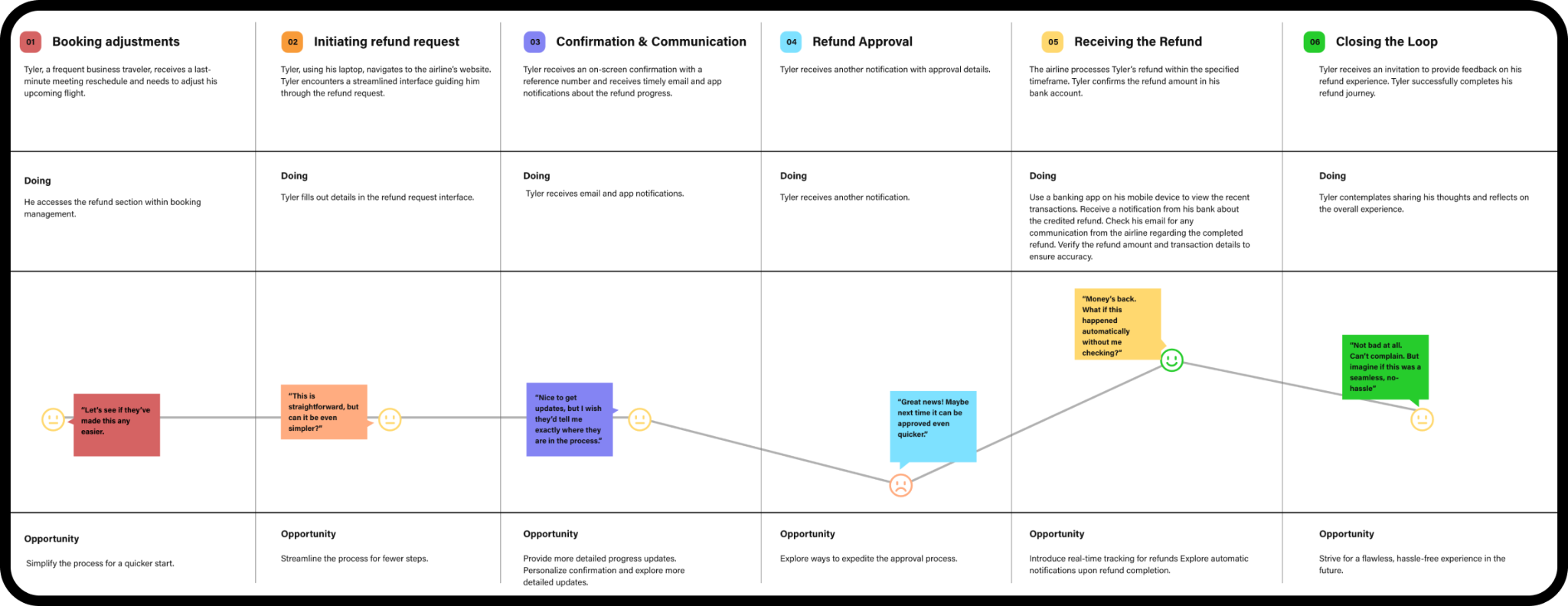
The journey exposed a silent period after submission where confidence dropped and support contacts increased.
SOLUTION
Plain-language policy guidance, an eligibility checklist, a mobile refund portal, and proactive status updates make the service easier to follow.
Guide travelers through the required details and evidence.
Show Submitted, Under Review, and Processed states.
Confirm submission, approval, and payment timing.
RESULTS
Higher satisfaction
Faster processing
Fewer inquiries
04
Greater confidence
KEY LEARNINGS
Reducing complexity improves confidence.
Updates at every stage reduce anxiety.
Clear explanations matter when plans have changed.
NEXT STEPS
Continue testing notification timing, status language, and self-service support so travelers always know when they need to act.