RAIL OPERATIONS · PRODUCT DESIGN
I redesigned Transit Performance to help customers compare routes, spot delays, and plan more reliable shipments without working through dense reports.
PROBLEM
Teams had to combine data from multiple places, compare routes manually, and wait too long to recognize service risks.
APPROACH
I combined interviews, competitive research, workflow review, and journey mapping to define a clearer monitoring experience.
01
Compare tracking, analytics, transparency, and notifications.
02
Understand monitoring, reporting, and exception handling.
03
Connect research, booking, transit, rail movement, and delivery.
APPROACH · MARKET RESEARCH
FedEx, UPS, and DHL showed how proactive notifications, clear milestones, and consistent status language can support faster action.
APPROACH · USER INTERVIEWS
Logistics managers, operations teams, and analysts prioritized real-time tracking, comparable performance, simpler reporting, and mobile access.
Show risks before they grow.
Use consistent measures across routes.
Make the same information available across devices.
APPROACH · USER PERSONA
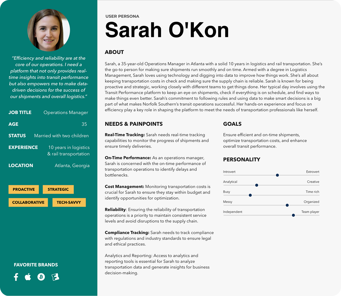
Sarah is an operations manager responsible for reliable shipments, cost control, and on-time performance.
APPROACH · USER JOURNEY
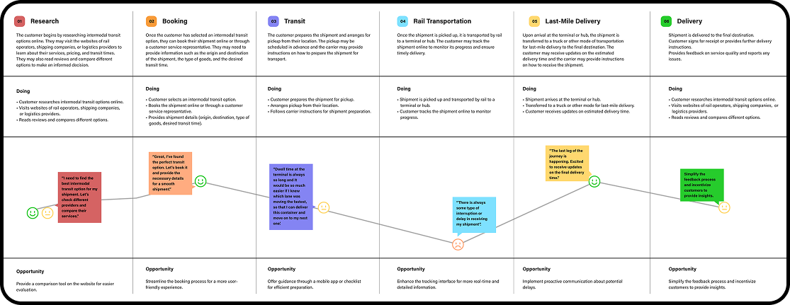
Mapping the shipment journey revealed opportunities across research, booking, terminal dwell, rail movement, last-mile delivery, and feedback.
SOLUTION
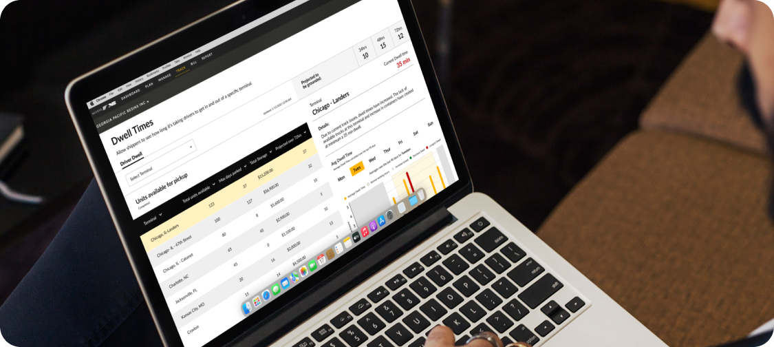
The platform brings on-time performance, dwell, empty fill rate, historical trends, forecasts, filters, and notifications into one responsive view.
Compare routes and spot exceptions quickly.
Benchmark performance and identify opportunities.
Use consistent information in the office and on the go.
RESULTS
On-time performance improvement
Increase in customer satisfaction
Shared performance language
KEY LEARNINGS
Multiple sources must form one trustworthy view.
Hierarchy makes complex information usable.
Updates support trust and proactive decisions.
NEXT STEPS
Continue refining predictive signals, exception alerts, and role-based views so teams can act before service issues affect customers.