Market research
Compared airline policies, digital flows, notifications, and refund choices.

 Travel · Service design
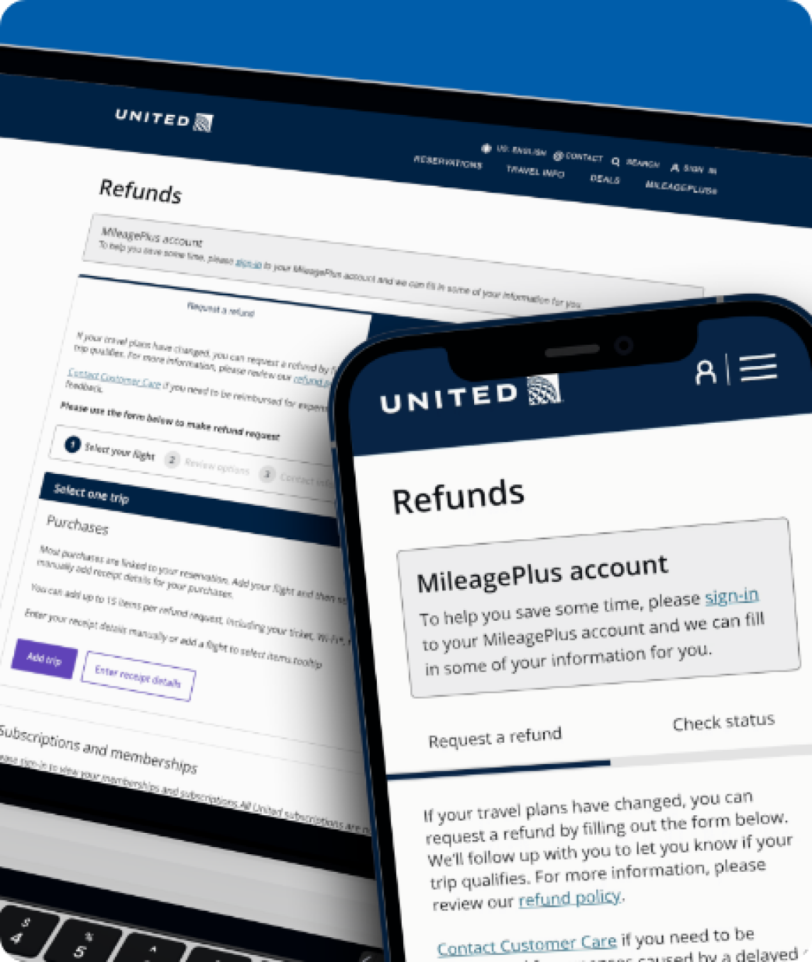
As Senior UX Designer, I redesigned United’s refund journey across eligibility, submission, and post-request visibility. I translated policy-heavy requirements into a clearer experience so travelers could understand what they qualified for, complete the request, and know what would happen next.
Problem
Passengers struggled to understand the policy, submit requests, and receive timely updates. This increased frustration and drove avoidable contacts to customer service.

Approach · User interviews
Across 15 interviews, people consistently described difficulty finding information, long waits without updates, and anxiety around fees and policy terms.

“I want clear instructions and updates at each step. Waiting for weeks with no communication is frustrating.”
Key need: A streamlined process with regular status updates.

“When plans change, the refund process needs to be fast and flexible. I do not have time for complications.”
Key need: Fast, flexible service for sudden changes.

“I do not travel often, so I need simple steps that do not require a lot of effort to understand.”
Key need: Plain-language instructions and minimal steps.

“As a frequent United flyer, I expect the refund process to feel seamless and transparent.”
Key need: Quicker communication and greater visibility.
Use jargon-free communication.
Show progress in real time.
Provide empathetic support during disruptions.
Approach · User persona
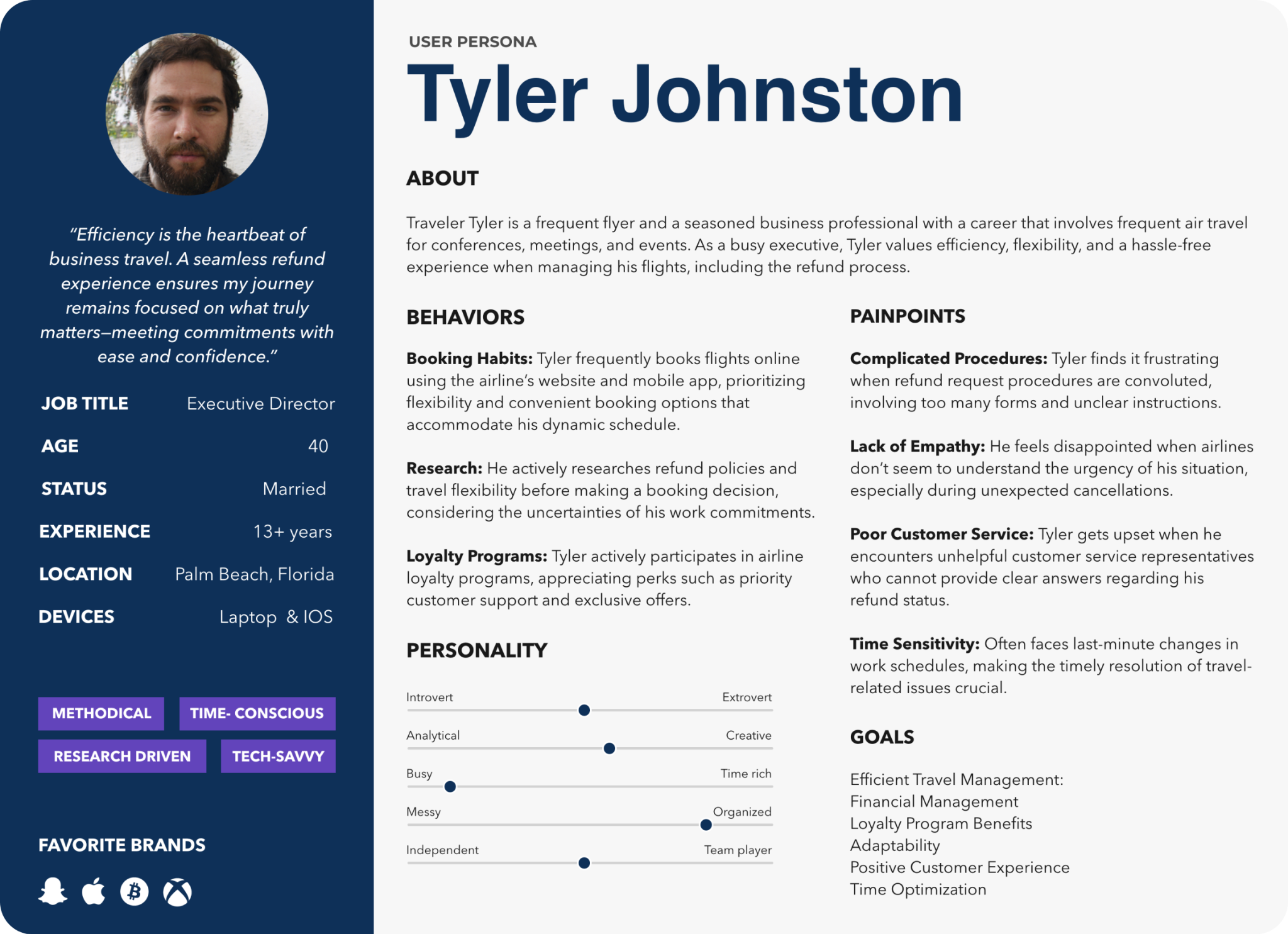
Tyler represents a frequent business traveler who wants to handle the refund himself without spending time searching for answers. He needs flexibility, predictable timelines, and status updates without having to call United.
Approach · User journey
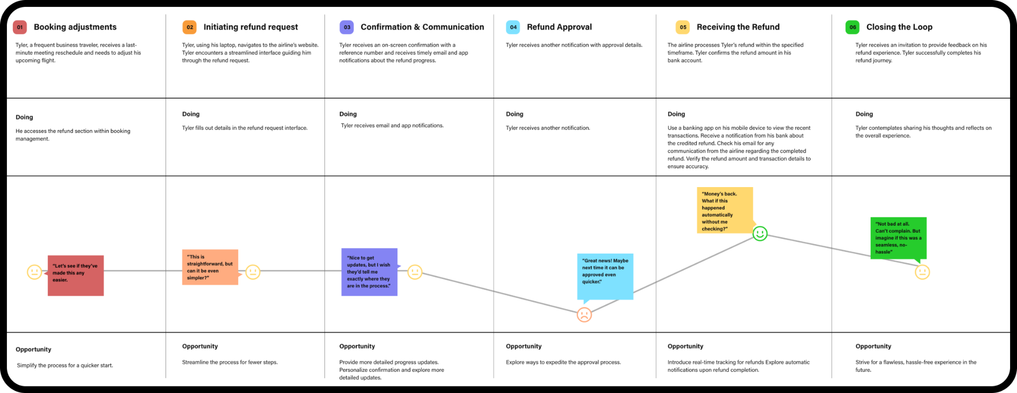
Mapping Tyler’s experience helped us see where confusion built up, from finding the policy to submitting a request and waiting for a response. The biggest opportunity was the silent period after submission.
Solution
The policy was rewritten in plain language, supported by a short eligibility checklist and mobile-optimized portal. FAQs, policy help, and live chat remained close at hand.
A guided flow captures the reason, supporting details, and required evidence.
A progress tracker shows Request Submitted, Under Review, and Refund Processed.
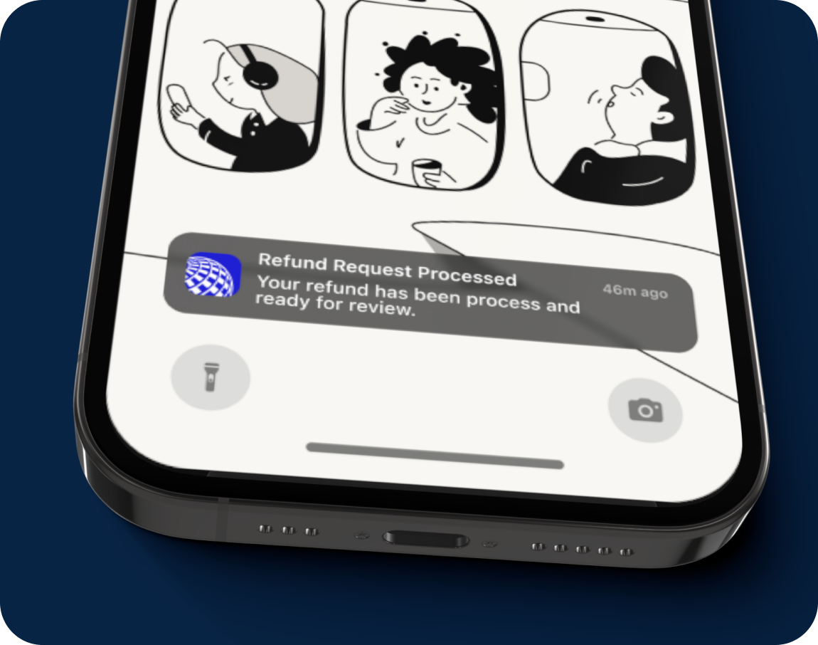
Email and SMS updates confirm submission, approval, and payment timing.