Market research
Benchmark mortgage POS experiences and identify established patterns.

As Senior Product Designer, I redesigned Maxwell’s Point of Sale experience for borrowers and loan officers. I used research, prototyping, and usability testing to simplify application steps, clarify document requests, and make progress easier to understand across the mortgage journey.
Problem
Maxwell’s original POS system was functional but slow, outdated, and overly complex. Borrowers dropped out of the process, while loan officers spent too much time managing manual paperwork.
Less paperwork.
Clearer progress.
More confidence.
Approach
We focused on making everyday tasks easier: uploading documents, checking application status, and helping loan officers process applications. Mobile access, automation, and the protection of sensitive information guided the redesign.
Benchmark mortgage POS experiences and identify established patterns.

Understand borrowers, brokers, and loan officers through interviews and surveys.
Use interactive prototypes to validate navigation, workflows, and task completion.
Approach · Market research
We reviewed mortgage platforms, including Ellie Mae’s Encompass and other industry leaders, to understand common features, strengths, and weaknesses. The analysis informed how we approached application structure, document handling, and lender workflows.
Approach · User interviews
Interviews and surveys with loan officers, brokers, and borrowers revealed a process that felt cumbersome, slow, and difficult to navigate. The main themes are summarized below.
Paperwork and repeated tasks increased the effort required to move forward.
Long response times made it difficult to know when to act.
Inconsistent updates obscured progress and created uncertainty.
Approach · User persona
I used the research to compare what borrowers and loan officers needed from the same application process.
Goals: complete the application, provide documents, and understand what happens next.
Frustrations: unfamiliar steps, paperwork, long waits, and inconsistent updates.
Needs: clear guidance, mobile access, visible progress, and confidence when sharing personal information.
Goals: manage loans efficiently and help borrowers complete requirements.
Frustrations: manual data entry, paperwork, and time spent chasing information.
Needs: streamlined workflows, document verification, and synchronized loan data.
Approach · User journey
We developed wireframes to rethink navigation and simplify application, approval, and document verification. The design explored mobile access, workflow automation, real-time verification, and eSign to reduce manual effort.
The refinance designs follow a guided sequence from loan purpose and account creation through QuickApply, personal and loan details, assets and liabilities, legal questions, and final review.
Solution · Figma design screens
The application keeps the steps visible while giving borrowers one task to focus on at a time. Select a screen to see it at full size.
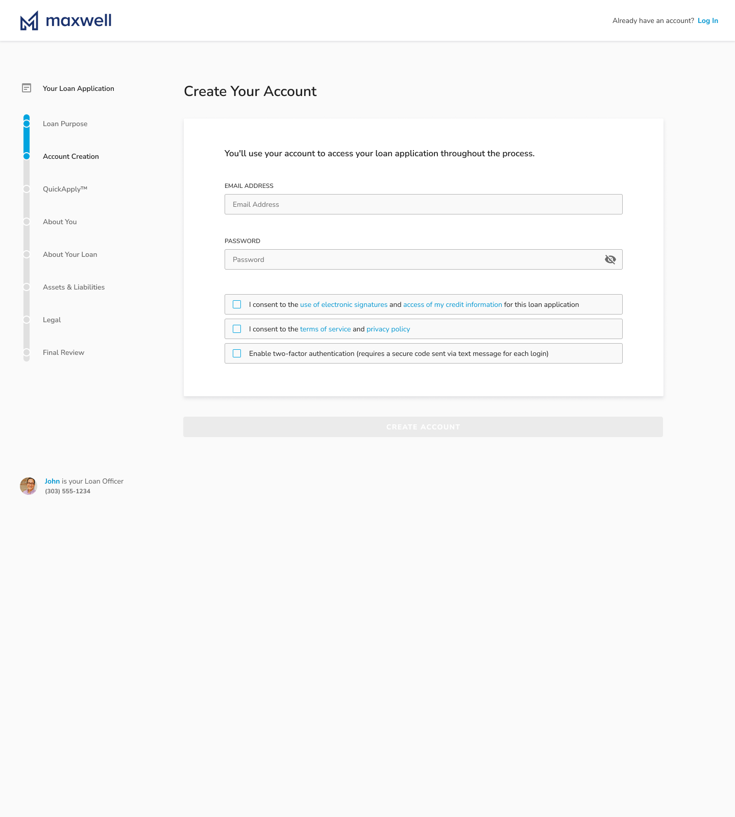
Account creation explains why an account is needed, presents consent choices, and offers two-factor authentication. The application steps remain visible alongside the form.
View original in Figma ↗
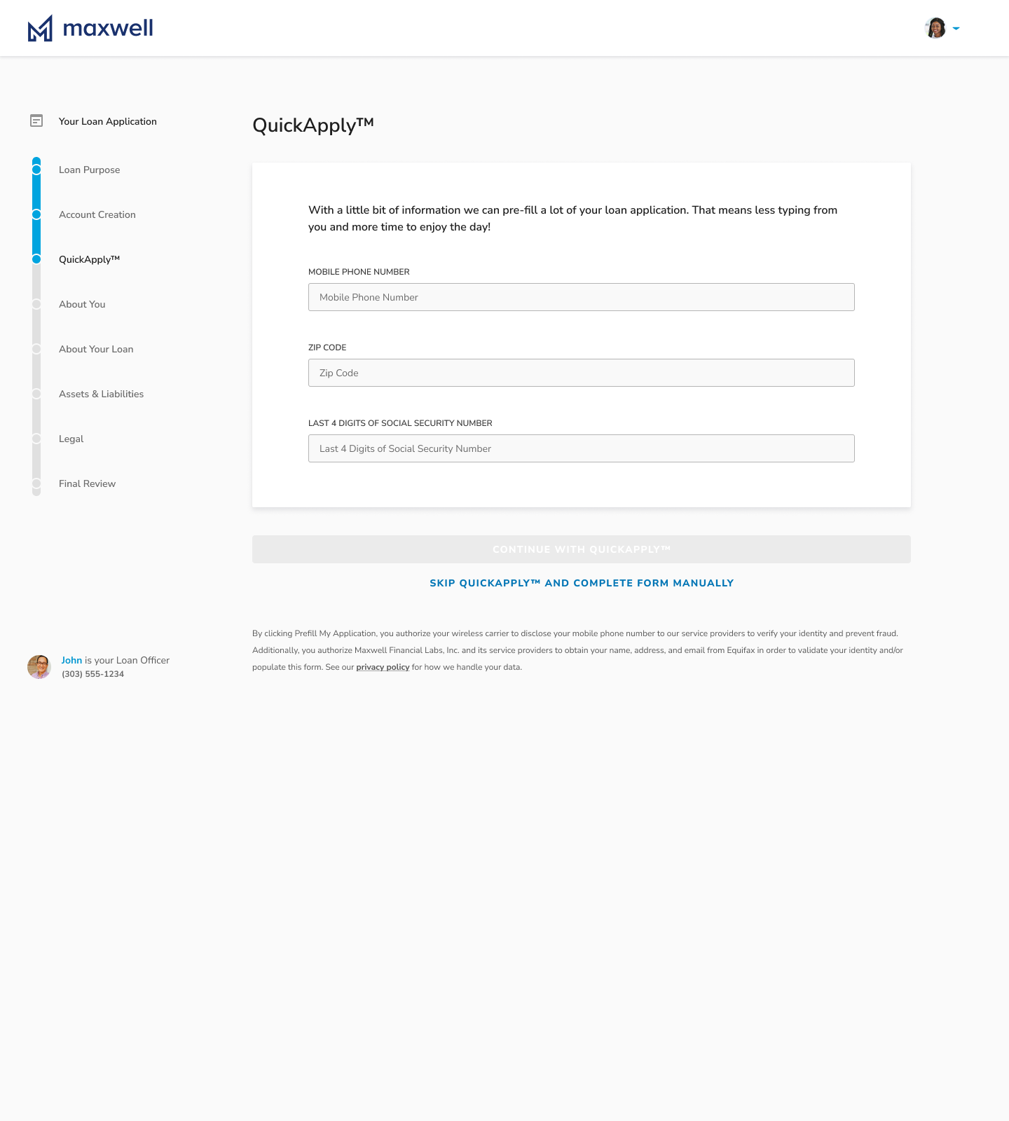
QuickApply explains the value of pre-filling information, requests a small set of identifying details, and offers a manual path for borrowers who prefer it.
View original in Figma ↗
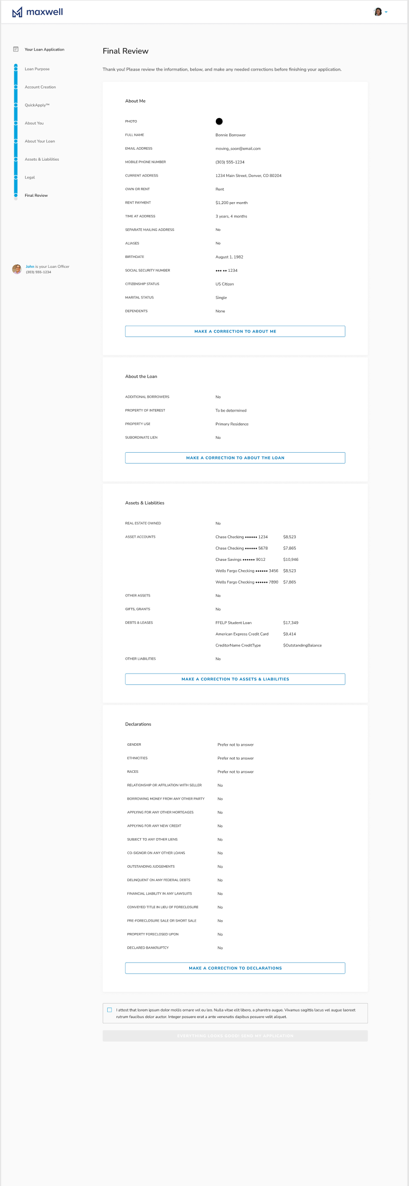
Final review groups information into familiar sections and provides correction actions so borrowers can check the application before submitting.
View original in Figma ↗Design rationale
A persistent step list anchors the experience. Focused content panels separate each task, explanatory copy clarifies why information is needed, and loan officer details keep support nearby.
The review screen closes the loop: borrowers can verify their answers and return to the relevant section to make a correction.
Usability testing
We tested several interactive prototypes with current Maxwell users to refine the design. Testing focused on the simplicity of loan origination, the effectiveness of automated workflows, and how easily borrowers could navigate the platform.
Collaboration
After validation, we collaborated with development to implement the redesigned experience.
Make key tasks accessible to loan officers and borrowers across devices.
Integrate with partners such as Day 1 Certainty and eSign vendors to streamline document workflows.
Keep loan data updated across devices and support officers managing multiple applications.
Results
Reported results included faster loan closures, more mobile use, and a higher monthly loan volume.
Loan officers closed loans faster with automated workflows and mobile-first design.
Borrowers and loan officers adopted the mobile-optimized experience.
Streamlined processes helped officers close more loans each month.
Borrowers reported a smoother experience. Both borrowers and loan officers praised eSign and document verification for reducing paperwork and making the process faster and more secure.
Key learnings
Mobile-first design matters when borrowers and loan officers need to manage loans on the go.
Simplifying origination and automating repetitive tasks improves both the experience and operational efficiency.
Ongoing testing and feedback help keep design decisions grounded in real needs and frustrations.
Next steps
Future work includes additional third-party integrations and exploring international localization, including currency handling and regional compliance requirements. These improvements are planned. Further user feedback would help set their priority.